Defect #1201
Assignee personal details on sprint sticker not displayed correctly
Description
Hi,
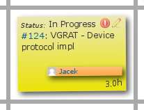
We are using Scrum 0.14.0 on top of Redmine 3.3.0. The problem I noticed lies in the fact that assignee personal details are too long to fit into this small sticker box. As a result assignee surname is moved to the next line and since overflow is set to hidden (the .post-it class), it's not visible. This may be ok in most cases, but when there are more than one person with the same name in a team, the stickers are misleading.
This is how sticker with a long personal (e.g. Jacek Thelongernamer) details are rendered:

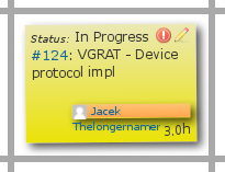
If I disable overflow we can see that surname is rendered line below:

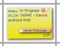
What I suggest to make this more readable is to modify this sticker class to include text-overflow set to ellipsis and white-space set to nowrap. This will result in:

The above attributes needs to be added to the selector:
374 .doer-post-it, .reviewer-post-it, .blocked-post-it {
375         height: 1.3em;
376         font-size: 0.8em;
377         margin-top: 2px;
378         text-align: left;
  +         text-overflow: ellipsis;
  +         white-space: nowrap;
379 }
It has to be done in file:
plugins/scrum/assets/stylesheets/scrum.css
I would change this by myself but I read this comment on the forum about no contribution to project source code. It's sad since there are fixes we can do on our own to make this plugin better.
Files
Subtasks
